NELSON BALABAN
SELECTED WORK
Pipefy is a workflow automation platform that enables companies to design, automate, and manage operational processes with greater efficiency and control. Over the past two years, the company has experienced strong international growth, expanding its customer base and reinforcing its position as a leading solution in the process management space. Despite its robust product and reputation for operational excellence, the brand lacked a distinctive and proprietary identity capable of consistently expressing its values and strengthening recognition across its touchpoints.
The branding project focused on translating Pipefy’s core concept—seamless workflows—into a cohesive visual and verbal language. After a strategic phase dedicated to gathering insights and refining the brand positioning, the identity system was developed from the essence of the name itself, expressing flow, clarity, and efficiency. The result is a scalable and recognizable brand experience that aligns the company’s visual presence with the strength of its platform and global ambitions.
The branding project focused on translating Pipefy’s core concept—seamless workflows—into a cohesive visual and verbal language. After a strategic phase dedicated to gathering insights and refining the brand positioning, the identity system was developed from the essence of the name itself, expressing flow, clarity, and efficiency. The result is a scalable and recognizable brand experience that aligns the company’s visual presence with the strength of its platform and global ambitions.
01
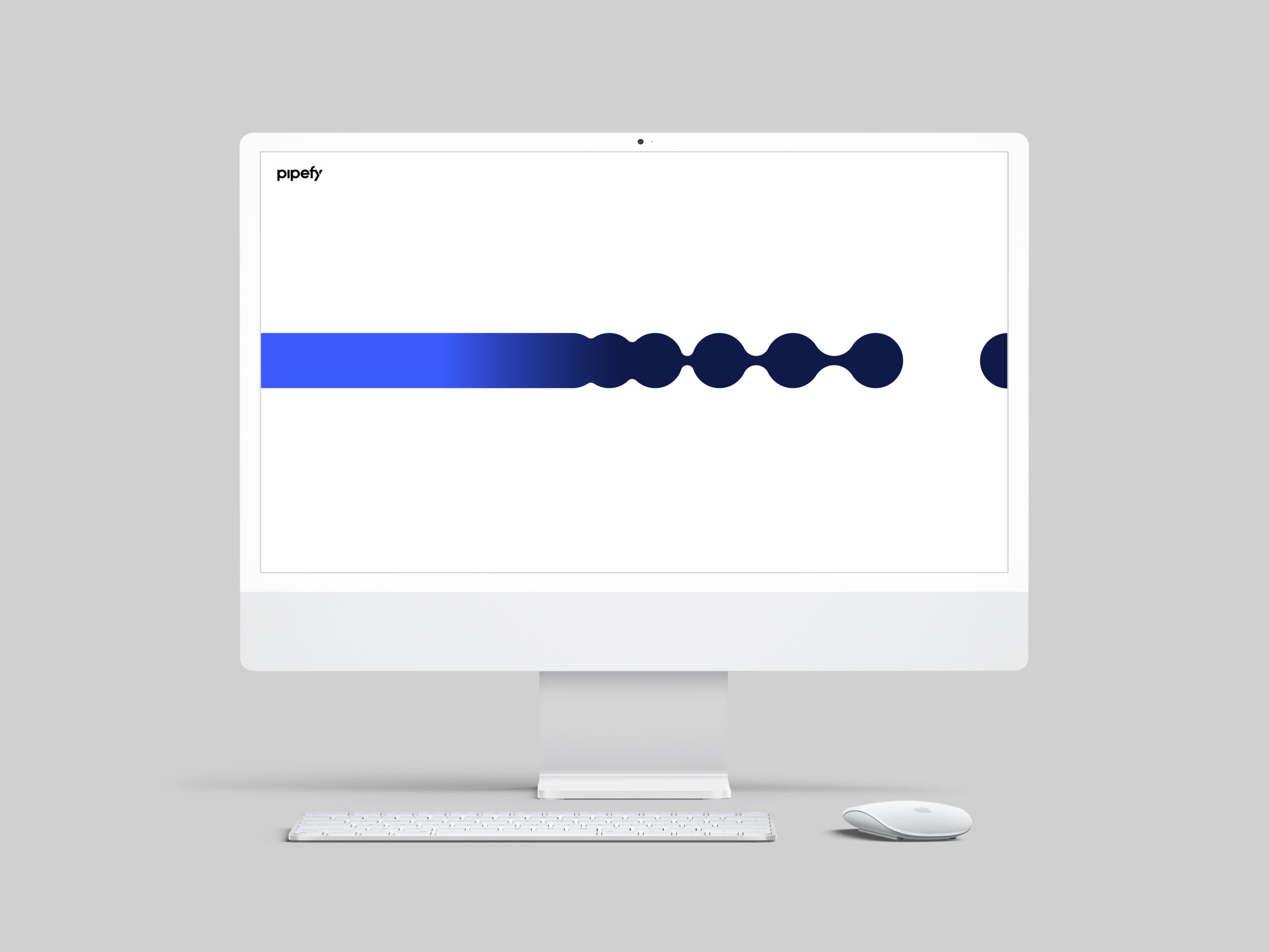
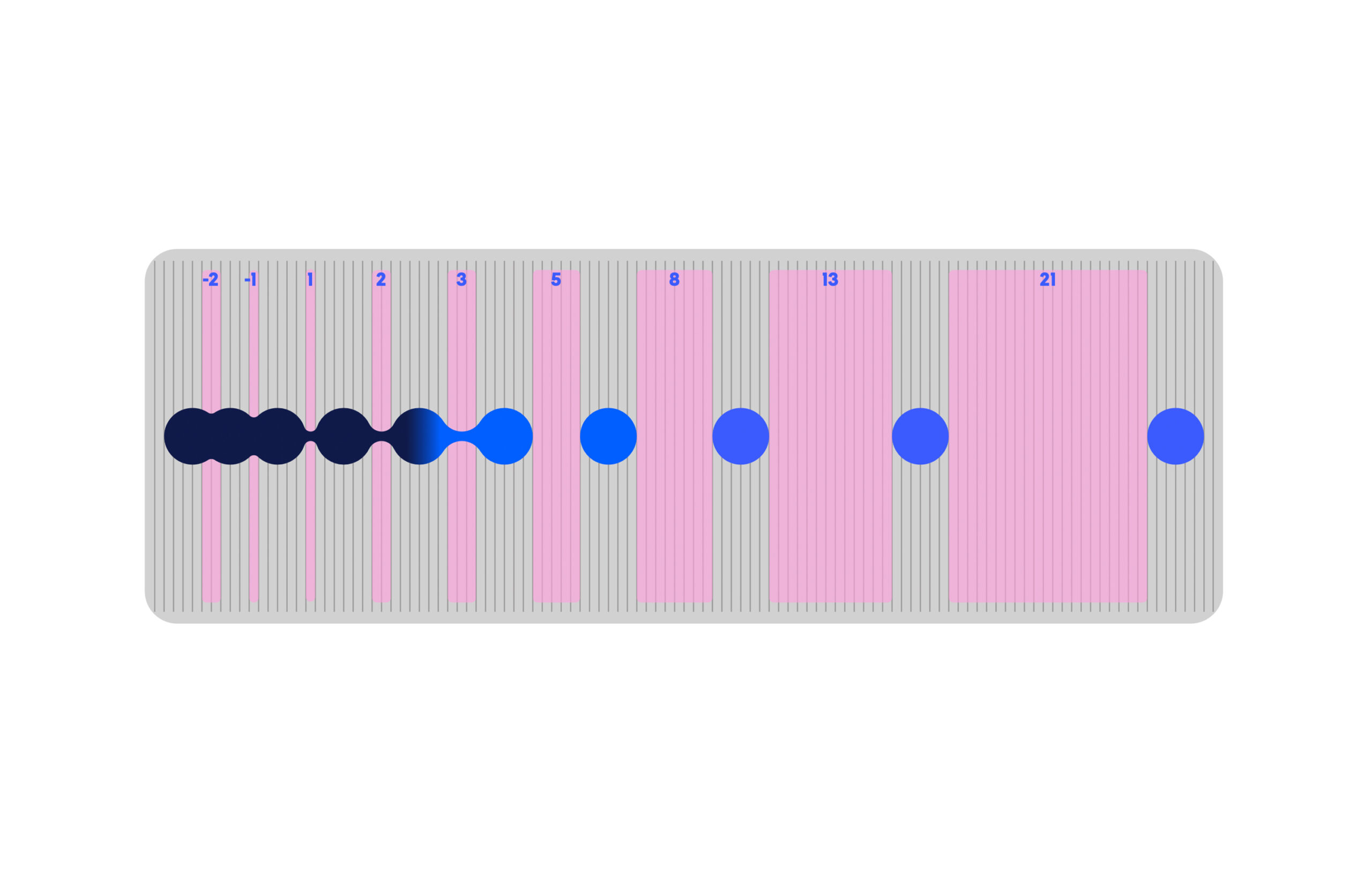
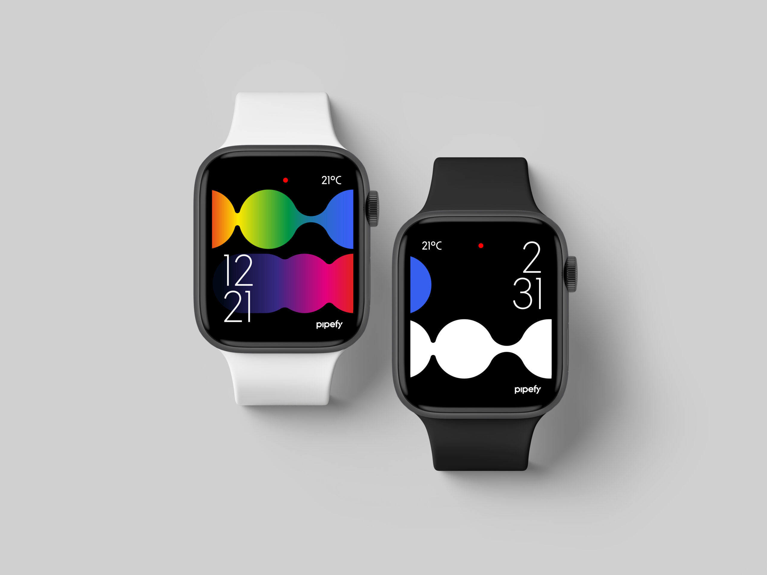
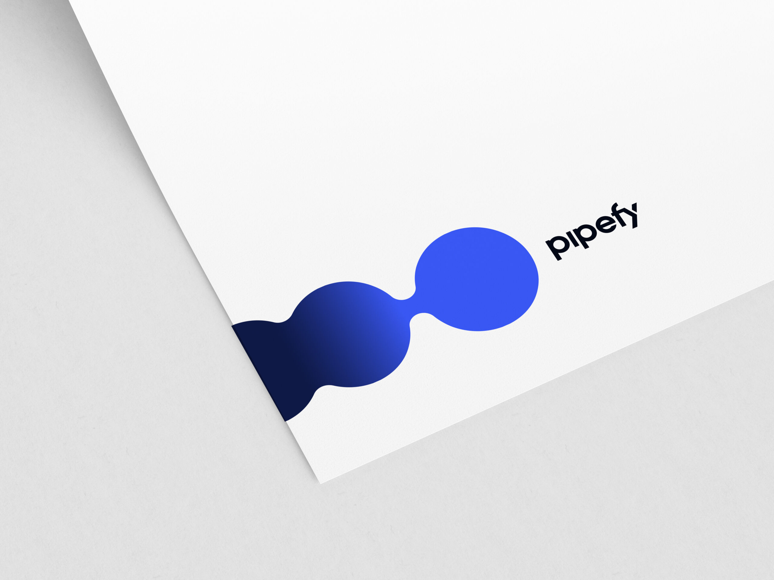
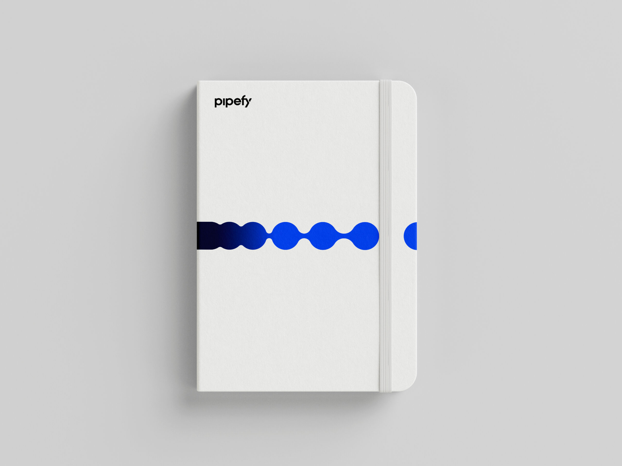
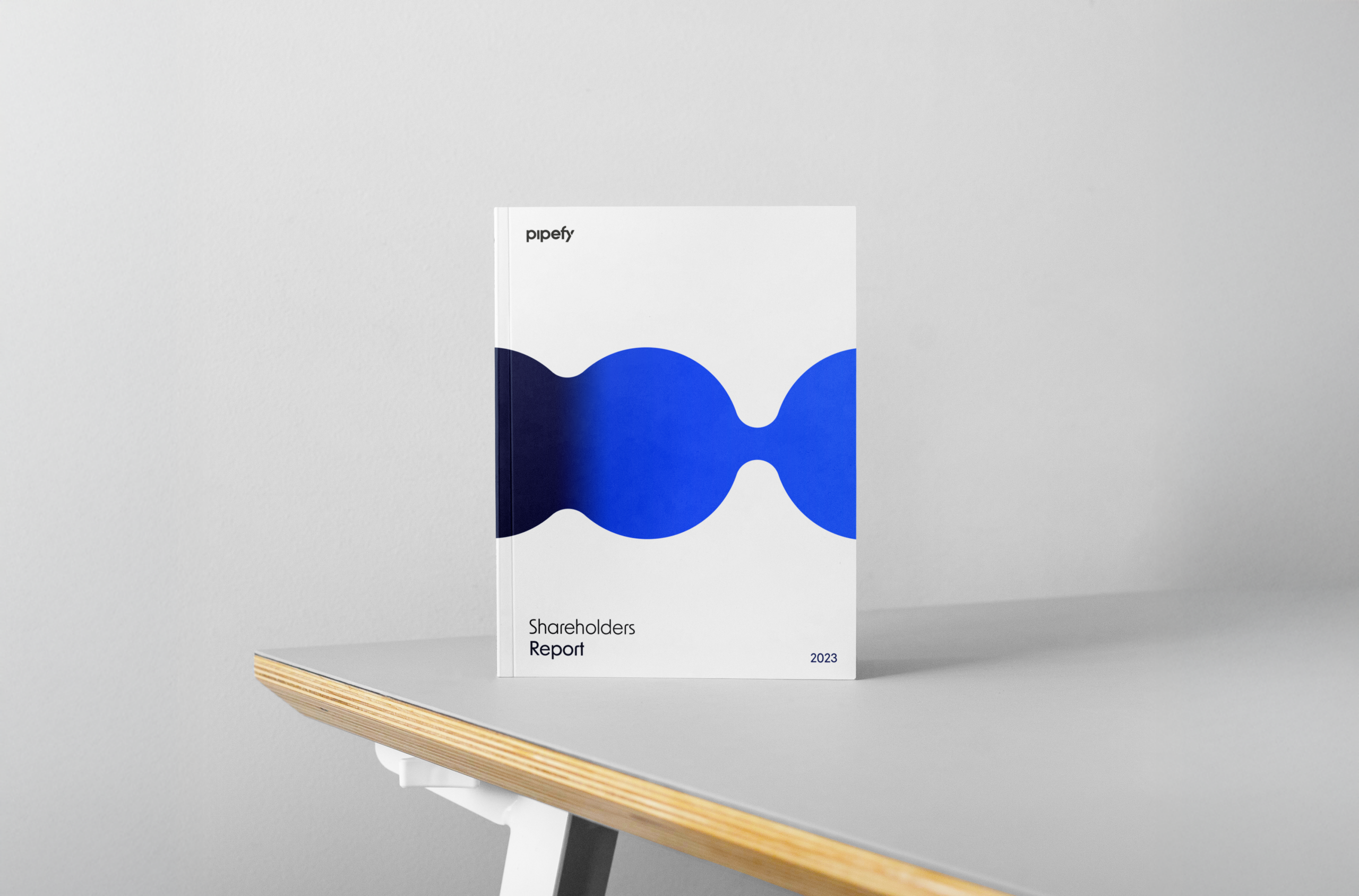
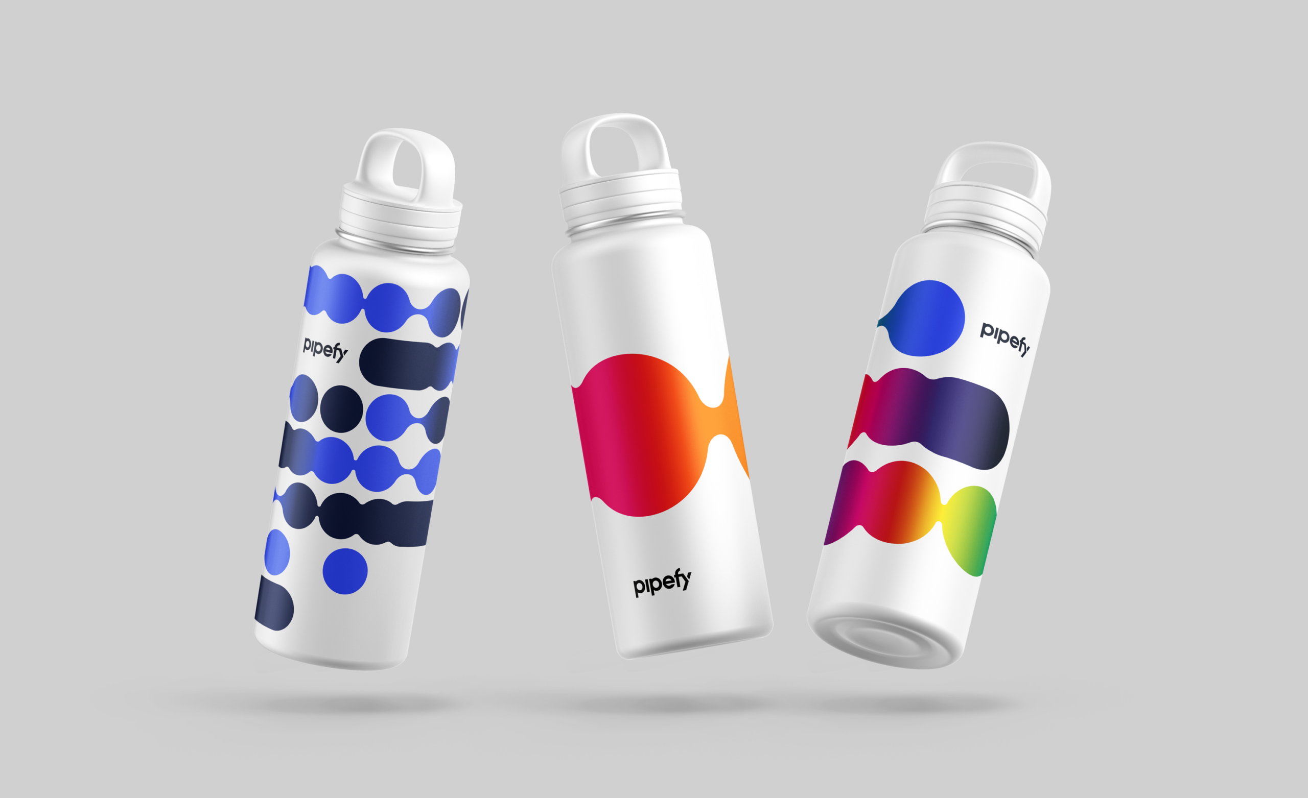
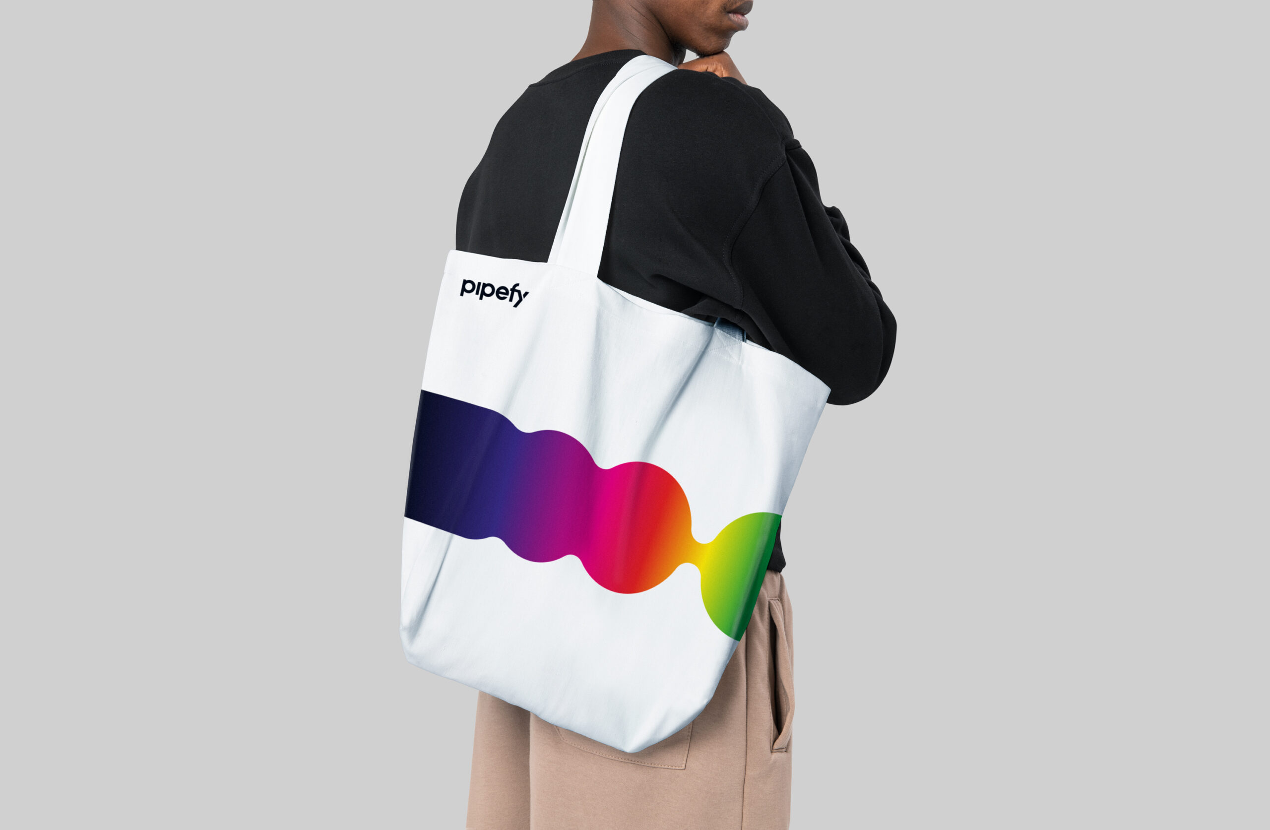
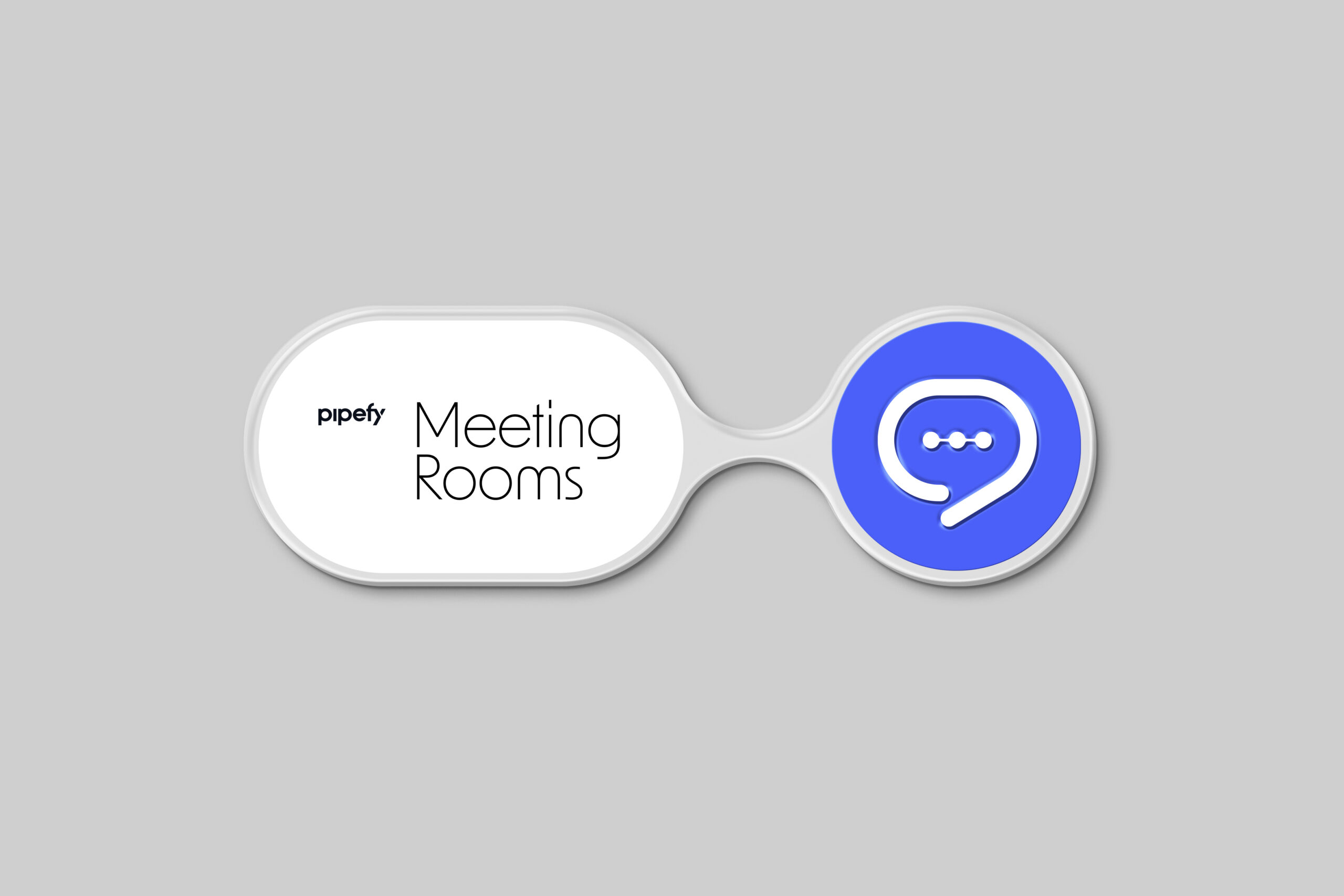
THE FLOW
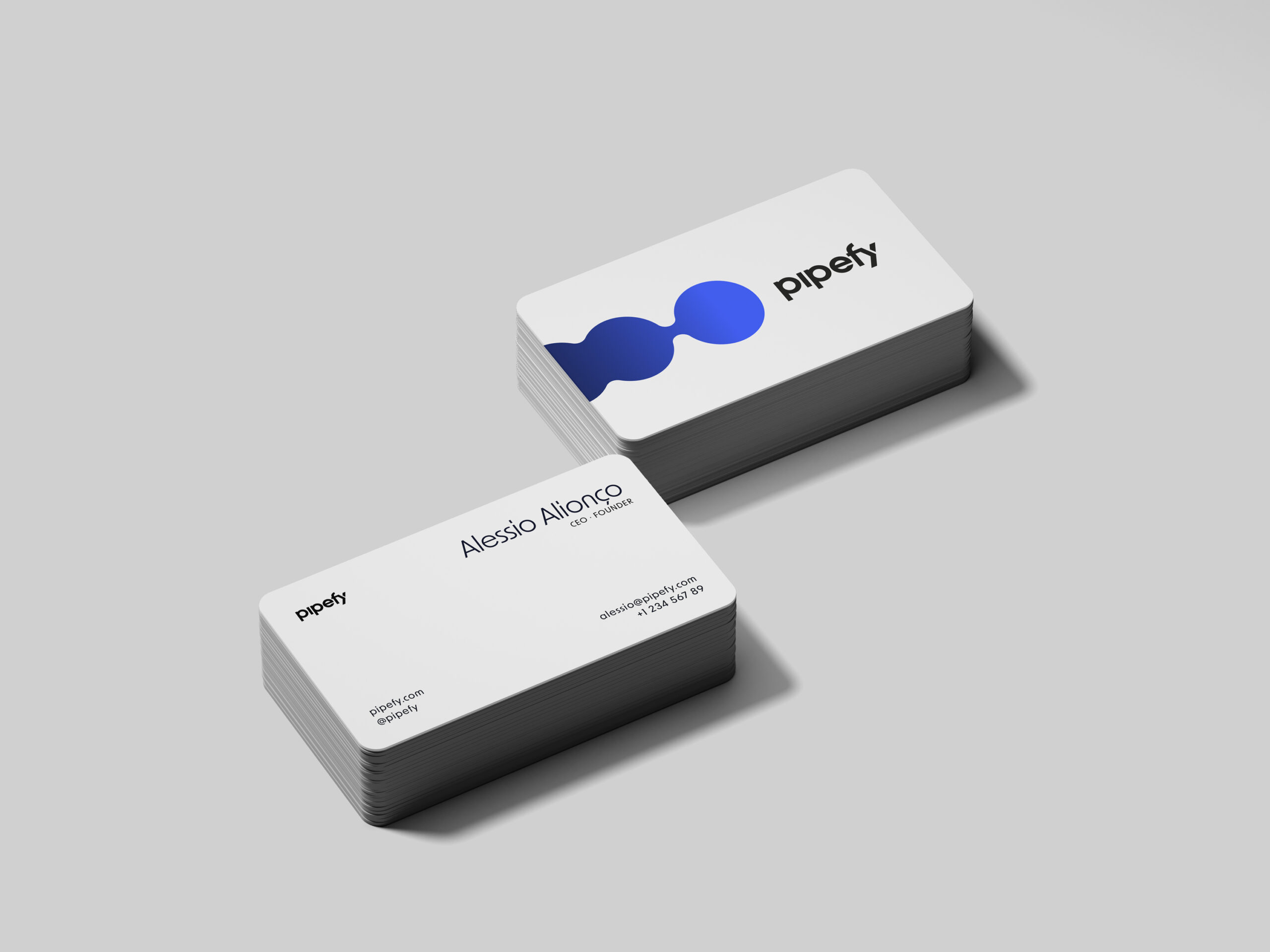
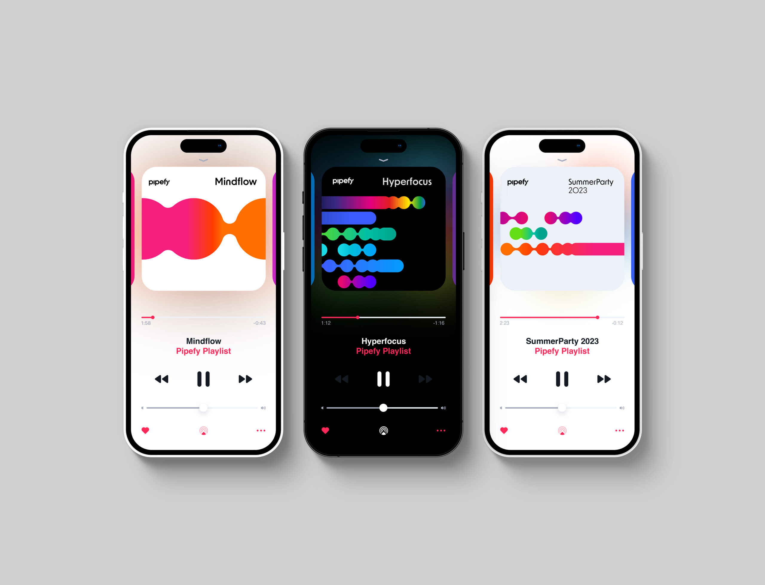
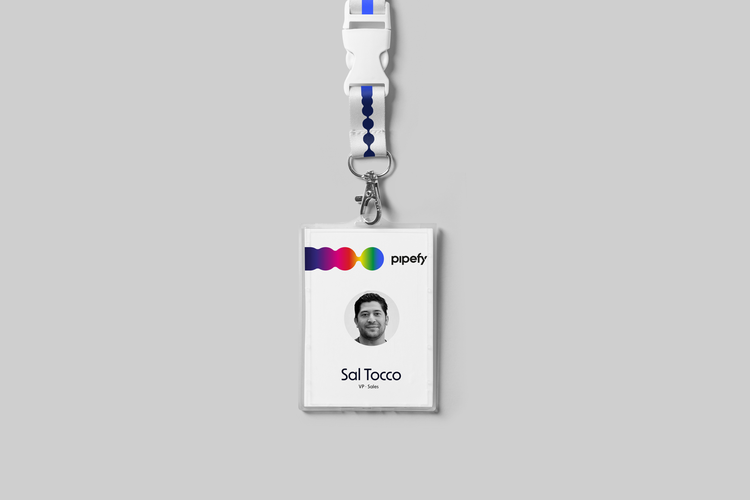
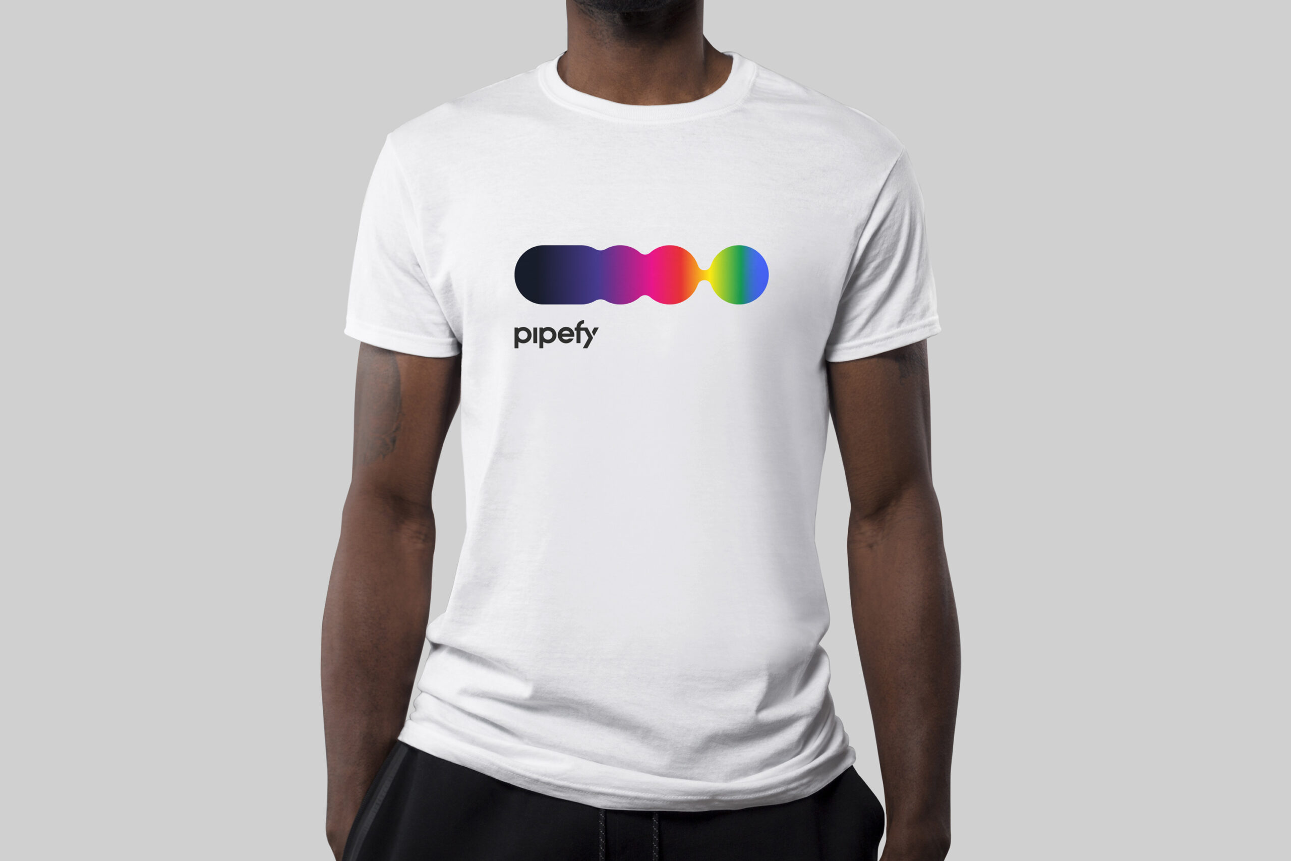
Pipefy's no-code workflow platform concept was translated into a unique visual identity system which is flexible, modular, vivid, and always in movement. The Flow can be used to convey process acceleration, revision and end-to-end clear communication through circles that are based on the Fibonacci sequence, forming multiple layers of visual elements that suit every scale within the brand's communication realm.
Assembling the campaign's graphic assets and the conceptual title ('Chaos in the greater area'), the key visual features a bold statement that merges São Paulo's urban scenario with a common situation in soccer when a dangerous player dominates the ball within the opponent's field.
NEXT PROJECT →
NEXT PROJECT →
NEXT PROJECT →
.