Following the sequel from the 2018 World Cup campaign, Nike Brazil approached me in order to create a series of visual concepts that embodied the aesthetic aspects found within the culture of wabi-sabi, which is inherent to the pulsating urban lifestyle of São Paulo: always under construction and progressive chaos.
In this occasion, I had the opportunity to come up with some copywriting alternatives which included the naming of the campaign (São Paulo's area code) and the conceptual title, later on incorporated in the visual concepts.
01
KEY VISUAL
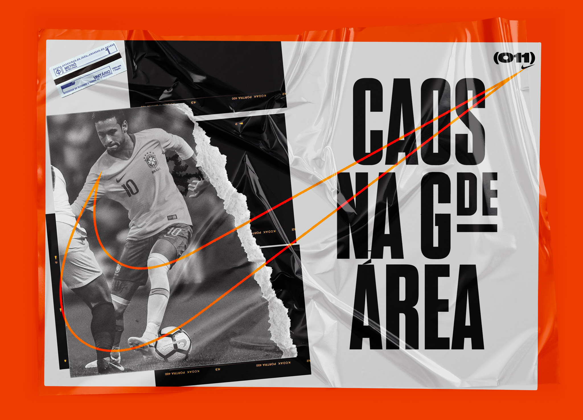
Assembling the campaign's graphic assets and the conceptual title ('Chaos in the greater area'), the key visual features a bold statement that merges São Paulo's urban scenario with a common situation in soccer when a dangerous player dominates the ball within the opponent's field.
Assembling the campaign's graphic assets and the conceptual title ('Chaos in the greater area'), the key visual features a bold statement that merges São Paulo's urban scenario with a common situation in soccer when a dangerous player dominates the ball within the opponent's field.
02
SCULPTURE
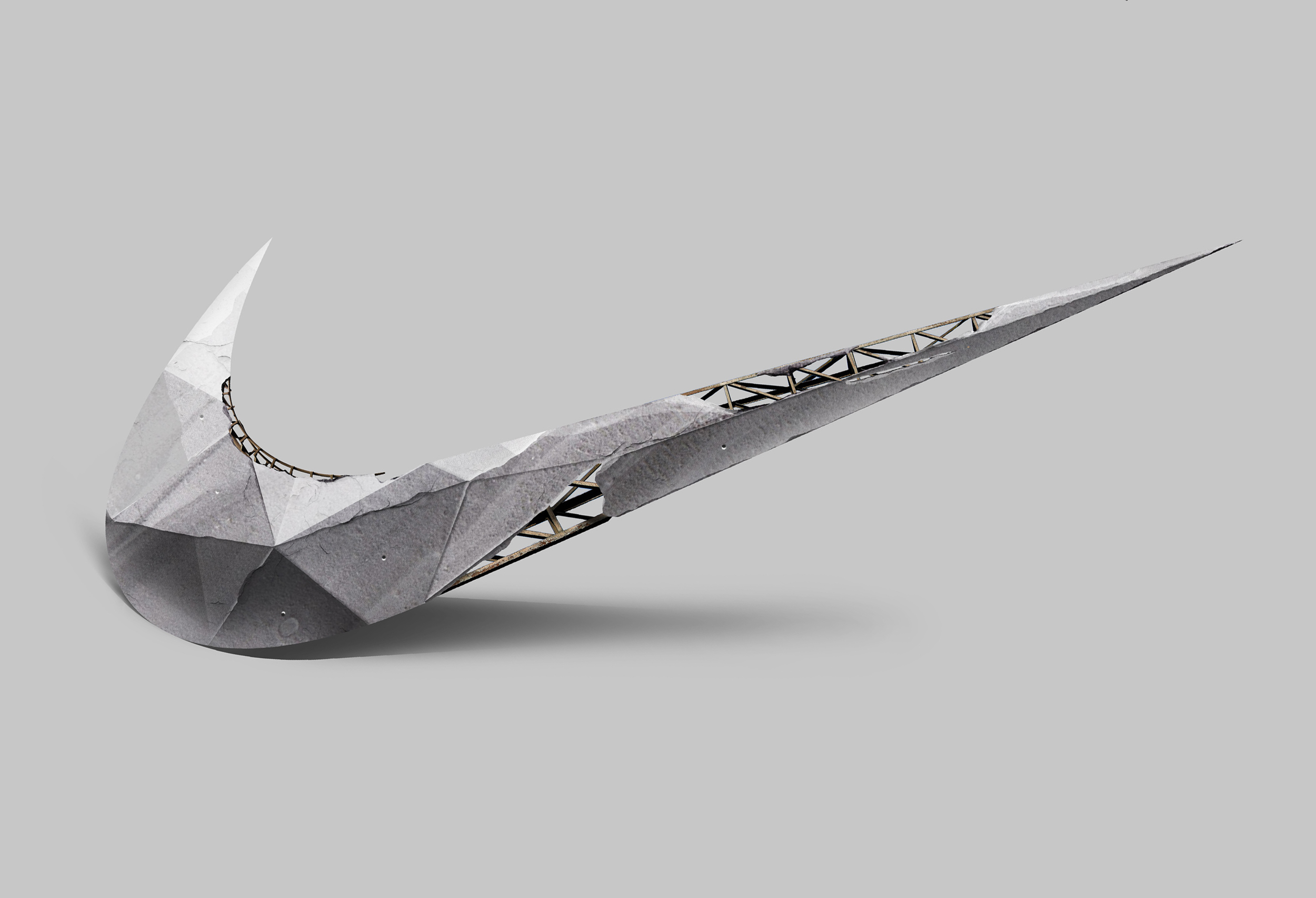
Considering the events which would take place in many spots across the city, a swoosh made out of a steel structure was simulated to establish the brand's presence and generate awareness.
Considering the events which would take place in many spots across the city, a swoosh made out of a steel structure was simulated to establish the brand's presence and generate awareness.
03
LOGOTYPE
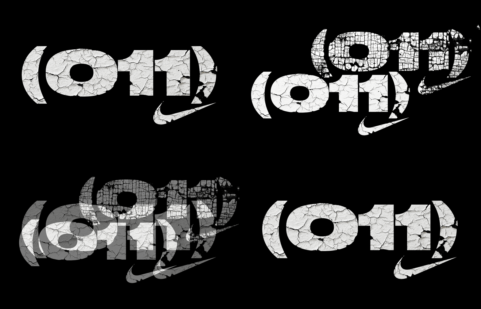
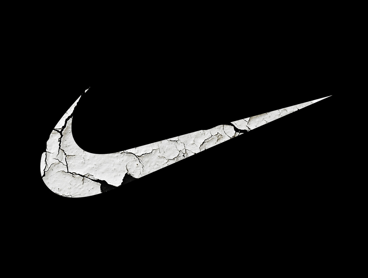
Representing São Paulo's area code, the campaign logo features a peeled wall texture that connects with the urban aesthetic of the city.
Representing São Paulo's area code, the campaign logo features a peeled wall texture that connects with the urban aesthetic of the city.
04
THE BALL
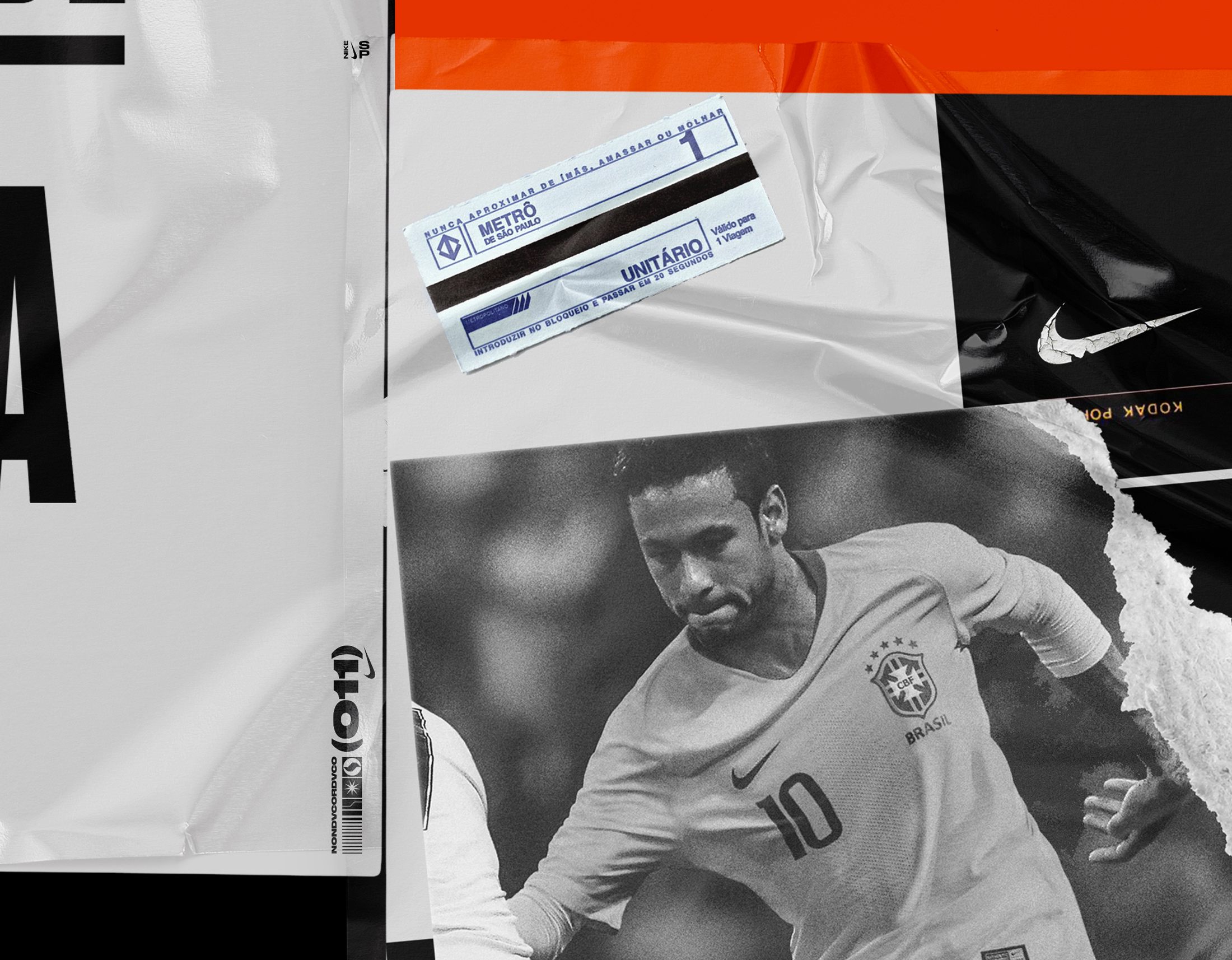
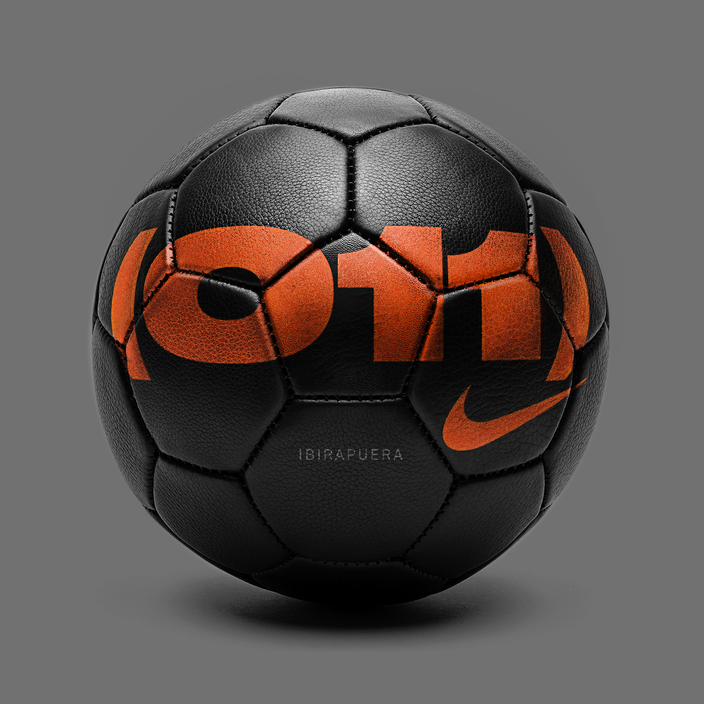
For every game a unique ball would be provided, identified with the spot's name.
For every game a unique ball would be provided, identified with the spot's name.
NEXT PROJECT →
NEXT PROJECT →
NEXT PROJECT →

